Best Chocolate Chip Ever
Our class embarked on a project which initially presented itself as a dense research task. Our primary exposure to the content revealed that it was laden with vast amounts of information, an extensive reading requirement, and an overwhelming presence of advertisements. Following a detailed analysis, our professor outlined the assignment's objective.

Objective
The aim was to streamline the content to enhance user experience on the website. This would facilitate a cleaner appearance for the blog while maintaining its revenue stream through advertisements, thereby balancing aesthetics with the commercial aspect.


Process
My initial strategy involved brainstorming a multitude of ideas. Believing that less could be more, I considered eliminating over half of the existing content. The plan was to retain the advertisements and introduce a video segment. This phase culminated in two preliminary sketches.
Final Product
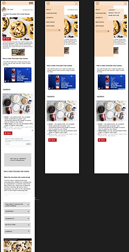
I introduced a fresh color palette and integrated a hamburger menu for improved navigation.
A logo was designed, which, along with the blogger's information, found its place in the page header.
: Rather than a lengthy, continuous flow of content, I introduced a concise presentation with an expandable '+' sign. This interactive element reveals an extended list upon user engagement.
Revamp: The menu was restructured to include a
dedicated contact information page. Additionally, interactive '+' signs and buttons were introduced to disclose Q&A sections and ingredient lists.
Conclusion


Throughout this project, I honed my ability to innovate without relying on external examples. While I'm proud of the end result, I wish I had more time to refine the design further. A notable challenge was re-familiarizing myself with Figma's prototyping tool, which demanded several hours of relearning. This experience underscored the importance of continual learning and adaptability in design.